

Ideas on marketing
that actually work.
Straight talk on SEO, paid media, web development and growth — no fluff, no recycled listicles.
From the DigiThames team.

Why 'Do Everything' Marketing Plans Usually Fail
Most early-stage marketing budgets get spread too thin across too many channels at once. A straightforward way to think about sequencing — what to prove out first, and what to deliberately leave until later.

SEO in 2026: Why Technical Fundamentals Still Win
Crawlability, site speed, and clean information architecture keep outperforming shortcuts. Before chasing the latest algorithm rumour, most sites still have basic technical issues quietly capping their visibility — here's what to check first.

Why Your Social Ads Look Like Ads (And How to Fix It)
The best-performing paid social creative rarely looks like traditional advertising. We break down why native-feeling formats consistently beat polished, brand-heavy creative — and how to brief for that without losing your brand identity.
Google Ads vs Microsoft Ads: Where Should Your Budget Actually Go?
Microsoft Ads is often written off as an afterthought, but for certain B2B and higher-value sectors it can deliver cheaper clicks with less competition. A practical framework for deciding where your next pound of PPC budget should land.
Writing for Humans First: A Practical Framework
Content written purely for search engines tends to convert poorly, even when it ranks. A simple structure for briefing copy that serves the reader's actual question first — and still gives search engines what they need.

The Subject Line Mistakes Killing Your Open Rates
Generic, overly-salesy subject lines are the fastest way into a spam-adjacent tab. A look at what actually gets an email opened — specificity, relevance to the segment, and a subject that doesn't read like every other promotion in the inbox.

Why Consistent Visuals Matter More Than a New Logo
A flashy new logo rarely moves the needle if everything around it — social posts, brochures, business creatives — still looks inconsistent. Visual consistency across every touchpoint builds recognition faster than any single design refresh.
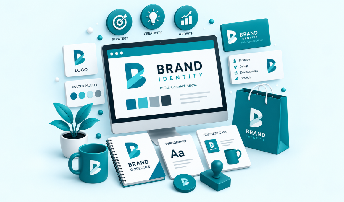
Brand Guidelines: The Document Most Small Businesses Skip
Without a written set of rules for logo usage, colour, and tone, a brand drifts a little more with every new designer, freelancer, or platform it touches. A lightweight guidelines document is one of the cheapest ways to keep it consistent.

The Real Cost of a Slow WordPress Site
Plugin bloat and unoptimised images are the two most common causes of a sluggish WordPress site — and both quietly cost rankings and conversions long before anyone complains about "the site feeling slow."
Why Visitors Decide in the First Five Seconds
Clever layouts lose to clear ones almost every time. A look at the handful of UI/UX decisions — hierarchy, whitespace, an obvious next step — that determine whether a first-time visitor sticks around or bounces.
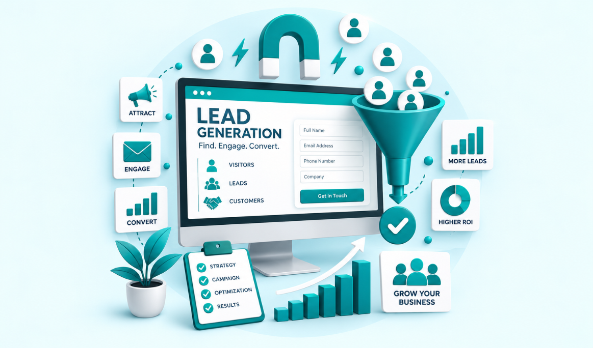
Why Most Landing Pages Fail to Convert
Too many form fields, a buried call to action, or a headline that doesn't match the ad that brought someone there — the most common lead-gen mistakes are rarely about traffic quality, they're about what happens after the click.
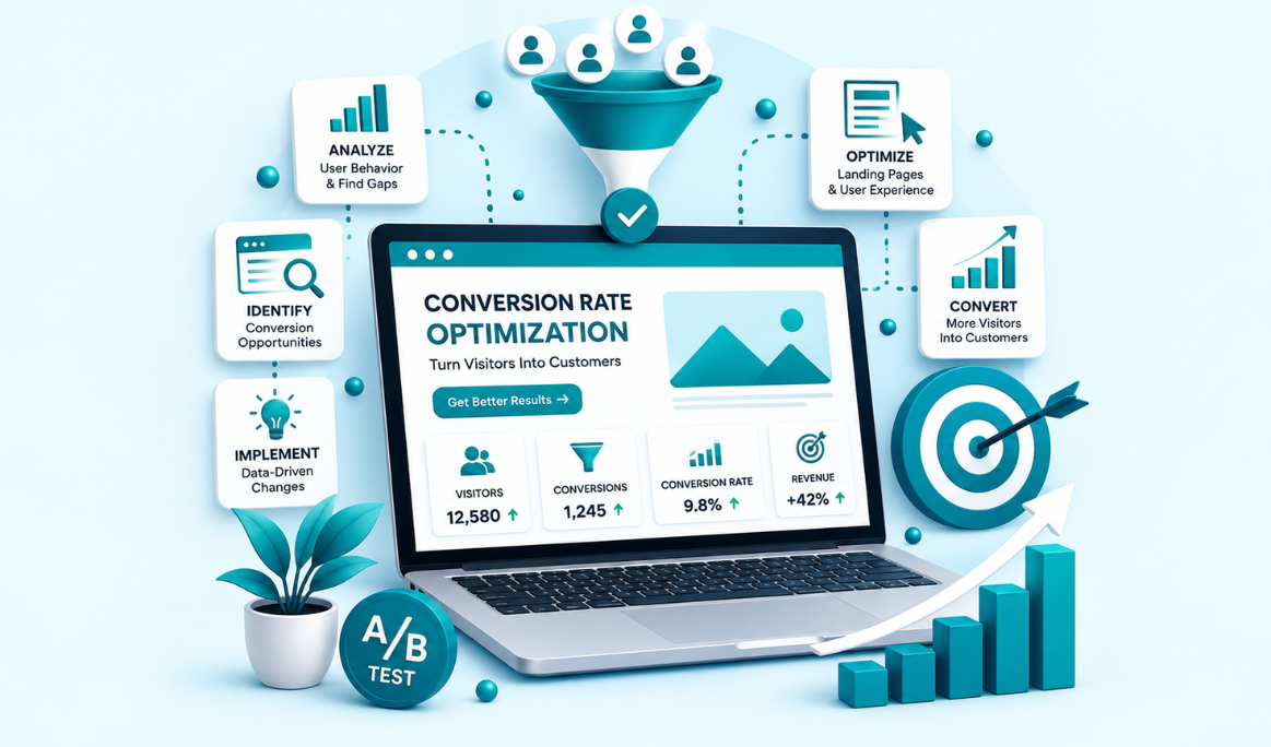
Small Changes That Actually Move Conversion Rates
Real CRO work starts with your highest-traffic pages, not the ones that feel most in need of a redesign. A practical way to prioritise what to test first, instead of chasing every micro-tweak a blog post recommends.
Join the discussion.
Got a question, a disagreement, or something to add? Genuine comments — from readers and clients alike — are welcome under every post.
No auto-replies — a real person on the team goes through every comment.
Comments are reviewed before they go live to keep spam out — genuine disagreement is fine.
It's only used to notify you of replies — never published or shared.
Leave a Comment
We read every one